Introduction
Many developers are still unaware of some design trends even after practicing web design for many years. In a bid to maximize the aesthetic value of web page layouts, designers and developers have adopted various design trends. The Parallax Effect, 3D graphics, Memphis design, Neo-brutalism, Visible boundaries, and Retro Revolutions are a few of these trends.
"How do you know which to use?" is the question.
In contemporary web design, designers and developers have adopted minimalism as a strategy for streamlining interface design by removing unnecessary components and focusing on performance. Design concepts like skeuomorphic design, flat design, and neomorphic design can be used to accomplish this.
In this article, we'll talk about the Neumorphism trend, which emphasizes minimalism in design circles, and show you how to use it as a web developer in CSS. You'll need a basic understanding of CSS and HTML to follow along with the article.
Steps we’ll cover:
- What is Neumorphism?
- Neumorphism in User Interface
- Neumorphism in Accessibility/User Experience
- Neumorphism in CSS
- Pros of using Neumorphism
- Cons of using Neumorphism
What is Neumorphism?
Neumorphism often referred to as Soft design, is a skeuomorphic design adaption coupled with flat design. It is a visual effect that mixes background colours, shadows, shapes, gradients, and highlights to achieve intense yet minimal real-life graphic effects on the user interface elements.
Neumorphism has made a significant impact on web design, simplifying and improving the user interface while facilitating interaction for people who are colour-blind or visually impaired. Neumorphism's uniformity and scalability are additional advantages.
Let's see how Neumorphism affects the user interface using what we know about it.
Neumorphism in User Interface
Neumorphism requires little or no use of flashy elements. The properties needed are shadows and lights.
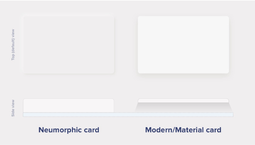
Neuomorphism makes UI elements appear inside or directly on the background layer, in contrast to other design trends that make items appear above the background.

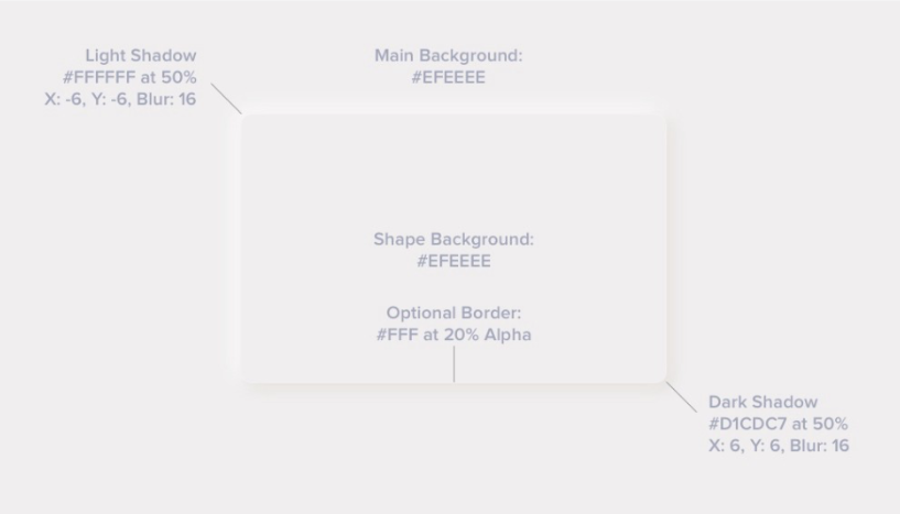
The image below illustrates the simplest UI design template for Neumorphism; feel free to modify it as you see fit.

The following are crucial guidelines from this recipe:
- Elements have background colours that match the parent element's background.
- Elements have almost transparent or no border.
- Shadows are in pairs, one with positive values and the other with negative values.
Neumorphism in Accessibility/User Experience
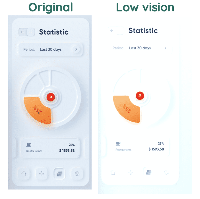
The main issue Neumorphism has in terms of accessibility is contrast; you'll notice that most Neumorphic designs use a grey-on-white colour scheme making it challenging for people to see if not implemented well, especially in bright light.
The image below displays an original Neumorphic design and the outcome under low vision.

Neumorphism's top accessibility rule is to comply with the Web Content Accessibility Guidelines WCAG 2.1 requirements on contrasts to make your design accessible to as many people as possible, including visually impaired users.
Another issue is with clickable items; even though you're aiming for minimalism, don't abuse the flat design idea. When users interact with clickable objects like buttons and links, they need to change their appearance and should be obvious.
Neumorphism in CSS
Now that you know how Neumorphism affects UI/UX let's look at how you as a developer might use it in actual projects.
Buttons
You should consider the normal and hover/clicked state when making a Neumorphic button. I've demonstrated how to style a button using the Neumorphism technique in the code sample below:
<button>Click me</button>
<style>
body {
  background: #ccc;
  display: grid;
  place-items: center;
}
button {
  background: #ccc;
  border: none;
  padding: 20px 40px;
  font-size: 20px;
  box-shadow: 5px 5px 10px rgba(163,177,198,0.5), -5px -5px 10px rgba(255, 255, 255, 0.6);
  cursor: pointer;
  border-radius: 15px;
}

button:hover {
  box-shadow: 5px 5px 10px rgba(163,177,198,0.7), -5px -5px 10px rgba(255, 255, 255, 0.4);
  filter: brightness(1.05);
}
</style>
Normal State

Hover State
You can check the codepen.
Cards
Cards are a type of container used to display sections in grids or galleries. I've demonstrated how to style a card with a header and body using the Neumorphism technique in the code sample below:
<div class="card">
  <div class="header">Header</div>
  <div class="body">Body</div>
</div>

<style>
body {
  background: #ccc;
  display: grid;
  place-items: center;
}
.card {
  width: 200px;
  height: 200px;
  background: #ccc;
  border: none;
  font-size: 20px;
  box-shadow: 5px 5px 10px rgba(163,177,198,0.5), -5px -5px 10px rgba(255, 255, 255, 0.6);
  cursor: pointer;
  border-radius: 15px;
  display: flex;
  flex-direction: column;
}
.card .header {
  box-shadow: 0px 1px 2px  rgba(163,177,198,0.5);
  border-radius: 15px 15px 0px 0px;
  padding: 10px;
  height: 40px;
}
.card .body {
  padding: 10px;
  flex: 1;
  border-radius: 0px 0px 15px 15px;
}

</style>

You can check the codepen.
Form Inputs
The text box and checkbox are examples of form inputs which make up a form in HTML. I've demonstrated how to style an HTML text box and checkbox using Neumorphism in the code snippet below:
Text box
<form>
  <label>Text box</label>
  <input type="text" placeholder="Text Box" />
</form>
<style>
body {
  background: #ccc;
  display: grid;
  place-items: center;
}
form {
  width: 250px;
  background: #ccc;
  border: none;
  box-shadow: 5px 5px 10px rgba(163, 177, 198, 0.5),
    -5px -5px 10px rgba(255, 255, 255, 0.6);
  padding: 20px;
  border-radius: 15px;
  display: flex;
  flex-direction: column;
}
label {
  padding: 10px 5px;
}
form input[type="text"] {
  background: #ccc;
  padding: 10px;
  height: 30px;
  border: none;
  box-shadow: inset 5px 5px 10px rgba(163, 177, 198, 0.5),
    inset -5px -5px 12px rgba(255, 255, 255, 0.8);
  outline: none;
  border-radius: 10px;
}
</style>

You can check the codepen
Checkbox
<form>
  <label>Checkbox</label>
  <div class="form_group">
    <input type="checkbox" id="checkbox" />
    <span class="span">
      <i class="fa fa-home"></i>
    </span>
  </div>
</form>
<style>
body {
  background: #ccc;
  display: grid;
  place-items: center;
}
form {
  width: 250px;
  background: #ccc;
  border: none;
  box-shadow: 5px 5px 10px rgba(163, 177, 198, 0.5),
    -5px -5px 10px rgba(255, 255, 255, 0.6);
  padding: 20px;
  border-radius: 15px;
  display: flex;
  flex-direction: column;
}
label {
  padding: 10px 5px;
}
form .form_group {
  width: 30px;
  height: 30px;
  position: relative;
  margin-top: 5px;
}
form .form_group input {
  width: 100%;
  height: 100%;
  position: absolute;
  top: 0px;
  opacity: 0;

}
form .form_group .span {
  background: #ccc;
  padding: 10px;
  height: 100%;
  width: 100%;
  border: none;
  box-shadow: 2px 2px 5px rgba(163, 177, 198, 0.8), -2px -2px 5px rgba(255, 255, 255, 0.8);
  outline: none;
  border-radius: 10px;
}

form .form_group .checked {
  box-shadow: inset 2px 2px 5px rgba(163, 177, 198, 0.8),
    inset -2px -2px 5px rgba(255, 255, 255, 0.8);
}
</style>
<script>
    let checkbox = document.querySelector("#checkbox")
    let span = document.querySelector(".span")

    checkbox.addEventListener("change", () => {
    span.classList.toggle("checked")
    })
</script>
Unchecked

Checked

You can check the codepen.
Pros of using Neumorphism
It is not sufficient to implement a concept; you also need to understand the requirements for using it. Neumorphism offers a variety of benefits and drawbacks that should be considered before adopting it.
When creating websites that demand users to interact with them for a long time, consider Neumorphism. Users dislike cluttered and complex user interfaces, and Neumorphism helps to keep things simple.
Neumorphism helps simplify decision-making when selecting colours. Additionally, since some people struggle with colour combinations, using Neumorphism reduces the chance of using conflicting colour schemes.
Elements resemble one another. It is easier to implement transitions without worrying about colour discrepancies. It is easier to switch between light and dark mode because there are fewer colours to convert.
Cons of using Neumorphism
Neumorphism is a great option to consider when designing, but it has some limitations, which does not imply that you shouldn't use it; you may need to take additional measures to get the best outcome.
Because Neumorphism elements share the same colour as the background, the contrast ratio is the most important concern. You should therefore handle contrast more carefully to prevent straining users' eyes.
Another issue is spacing; elements have pairs of shadows, which takes up more space than usual. You will need to manage space since pairing the shadow is necessary.
Users tend to miss Call To Actions(CTA) when Neumorphism is poorly implemented.
Neumorphism streamlines your creative options. Designers need to follow specific guidelines when applying elements like shadows, colours, and so on.
Conclusion
Using Neumorphism appropriately can produce mind-blowing results. You will have realistic-looking 3D effects, which improve your users' experience.
Visit this Neumorphism Playground if you wish to experiment with different ideas using Neumorphism. Additionally, you may learn more about Neumorphism's history and how it combines flat and skeuomorphic design.
Build your React-based CRUD applications without constraints
Low-code React frameworks are great for gaining development speed but they often fall short of flexibility if you need extensive styling and customization for your project.
Check out refine, if you are interested in a headless framework you can use with any custom design or UI-Kit for 100% control over styling.
refine is an open source, React-based framework for building CRUD applications without constraints. It can speed up your development time up to 3X without compromising freedom on styling, customization and project workflow.
refine is headless by design and it connects 30+ backend services out-of-the-box including custom REST and GraphQL API’s.
Visit refine GitHub repository for more information, demos, tutorials and example projects.


