Show
<Show> provides us a layout for displaying the page. It does not contain any logic but adds extra functionalities like a refresh button or giving title to the page.
We will show what <Show> does using properties with examples.
Properties
canDelete and canEdit
canDelete and canEdit allows us to add the delete and edit buttons inside the <Show> component. If the resource has canDelete or canEdit property refine adds the buttons by default.
When clicked on, delete button executes the useDelete method provided by the dataProvider and the edit button redirects the user to the record edit page.
Refer to the <DeleteButton> and the <EditButton> documentation for detailed usage.
import { Show, usePermissions } from "@pankod/refine";

export const ShowPage: React.FC = () => {
    const { data } = usePermissions<string>();

    return (
        <Show
            canDelete={data === "admin"}
            canEdit={data === "editor" || data === "admin"}
        >
            ...
        </Show>
    );
};
Refer to the usePermission documentation for detailed usage. →
title
It allows adding a title for the <Show> component. if you don't pass title props it uses the "Show" prefix and the singular resource name by default. For example, for the "posts" resource, it will be "Show post".
import { Show } from "@pankod/refine";

export const ShowPage: React.FC = () => {
    return <Show title="Custom Title">...</Show>;
};
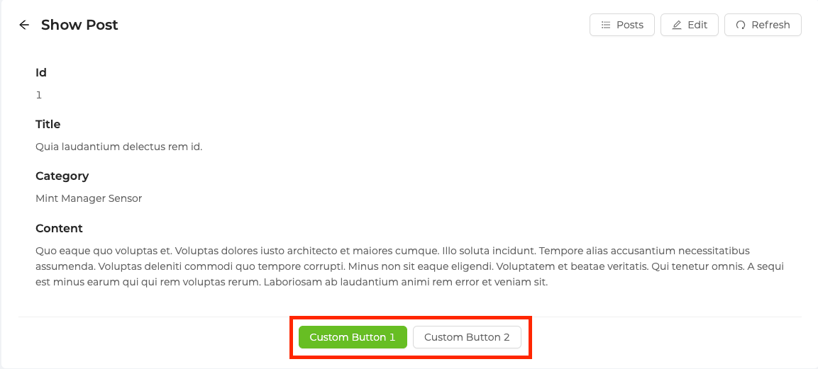
actionButtons
<Show> uses the Ant Design <Card> component so you can customize the action property with the properties of actionButtons. By default, the action property of the <Card> component shows nothing in the <Show> component.
import { Show, Space, Button } from "@pankod/refine";

export const ShowPage: React.FC = () => {
    return (
        <Show
            actionButtons={
                <Space>
                    <Button type="primary">Custom Button 1</Button>
                    <Button type="default">Custom Button 2</Button>
                </Space>
            }
        >
            ...
        </Show>
    );
};
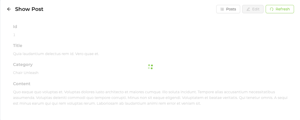
isLoading
Since <Show> uses the Ant Design <Card> component, the isLoading property can be set like the below.
import { useState } from "react";
import { Show, Modal, ShowButton, useShow } from "@pankod/refine";

export const ShowPage: React.FC = () => {
    const { queryResult } = useShow();
    const { isLoading } = queryResult;

    return <Show isLoading={isLoading}>...</Show>;
};
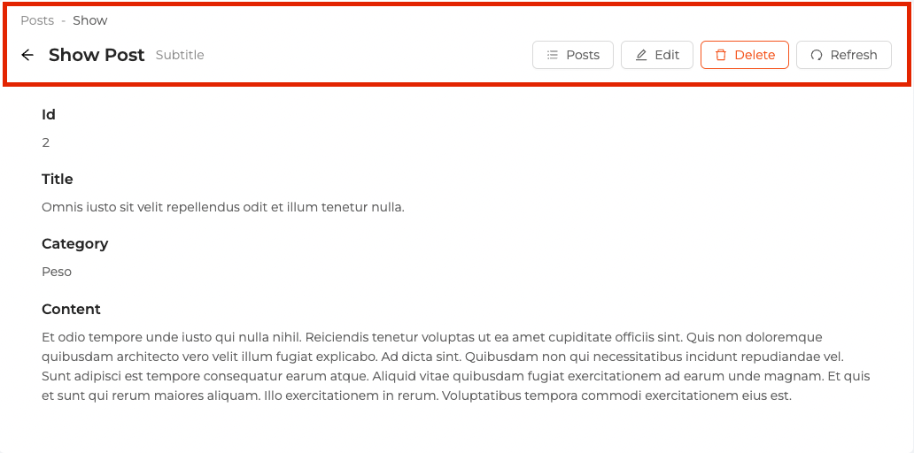
pageHeaderProps
<Show> uses the Ant Design <PageHeader> components so you can customize it with the properties of pageHeaderProps. By default, the extra property of the <PageHeader> component shows <RefreshButton>, <ListButton>, <EditButton> and <DeleteButton> based on your resource definition in the resources property you pass to <Refine>.
import { Show } from "@pankod/refine";

export const ShowPage: React.FC = () => {
    return (
        <Show
            pageHeaderProps={{
                onBack: () => console.log("Hello, refine"),
                subTitle: "Subtitle",
            }}
        >
            ...
        </Show>
    );
};
recordItemId
<Show> component reads the id information from the route by default. recordItemId is used when it cannot read from the URL (when used on a custom page, modal or drawer).
import { useState } from "react";
import { Show, Modal, ShowButton, useShow } from "@pankod/refine";

export const ShowPage: React.FC = () => {
    const [visibleShowModal, setVisibleShowModal] = useState<boolean>(false);

    const { queryResult, showId, setShowId } = useShow();
    const { data, isLoading } = queryResult;

    return (
        <>
            <ShowButton
                size="small"
                onClick={() => {
                    setShowId(data?.data.id);
                    setVisibleShowModal(true);
                }}
            />
            <Modal
                visible={visibleShowModal}
                onCancel={() => setVisibleShowModal(false)}
            >
                <Show recordItemId={showId} isLoading={isLoading}>
                    // show something with `data`
                </Show>
            </Modal>
        </>
    );
};
<Show> component needs the id information for <RefreshButton> to work properly.
resource
The <Show> component reads the resource information from the route by default. This default behavior will not work on custom pages. If you want to use the <Show> component in a custom page, you can use the resource property.
Refer to the custom pages documentation for detailed usage. →
import { Refine, Show } from "@pankod/refine";
import dataProvider from "@pankod/refine-simple-rest";
import routerProvider from "@pankod/refine-react-router";

const CustomPage = () => {
    return (
        <Show resource="posts" recordItemId="postId">
            ...
        </Show>
    );
};

export const App: React.FC = () => {
    return (
        <Refine
            routerProvider={{
                ...routerProvider,
                routes: [
                    {
                        exact: true,
                        component: CustomPage,
                        path: "/custom",
                    },
                ]
            }}
            dataProvider={dataProvider("https://api.fake-rest.refine.dev/")}
            resources={[{ name: "posts" }]}
        />
    );
};
The <Show> component needs the id information for work properly, so if you use the <Show> component in custom pages, you should pass the recordItemId property.
API Reference
Properties
| Property | Description | Type | Default |
|---|---|---|---|
| canDelete | Adds a delete button | boolean | If the resource has canDelete prop it is true else false |
| canEdit | Adds an edit button | boolean | If the resource has canEdit prop it is true else false |
| title | Adds a title | string | "Show" prefix and singular of resource.name |
| actionButtons | Gets passed to the extra prop of the <Card> | React.ReactNode | <SaveButton> and depending on your resource configuration (canDelete prop) |
| isLoading | Gets passed to the loading prop of the <Card> | boolean | false |
| pageHeaderProps | Passes props for <PageHeader> | PageHeaderProps | { ghost: false, title, extra: <ListButton> and <RefreshButton> } |
| recordItemId | Record id for <RefreshButton> | string | |
| resource | Resource name for API data interactions | string | Resource name that it reads from the URL. |