Boolean
This field is used to display boolean values. It uses the <Tooltip> values from Ant Design.
Usage
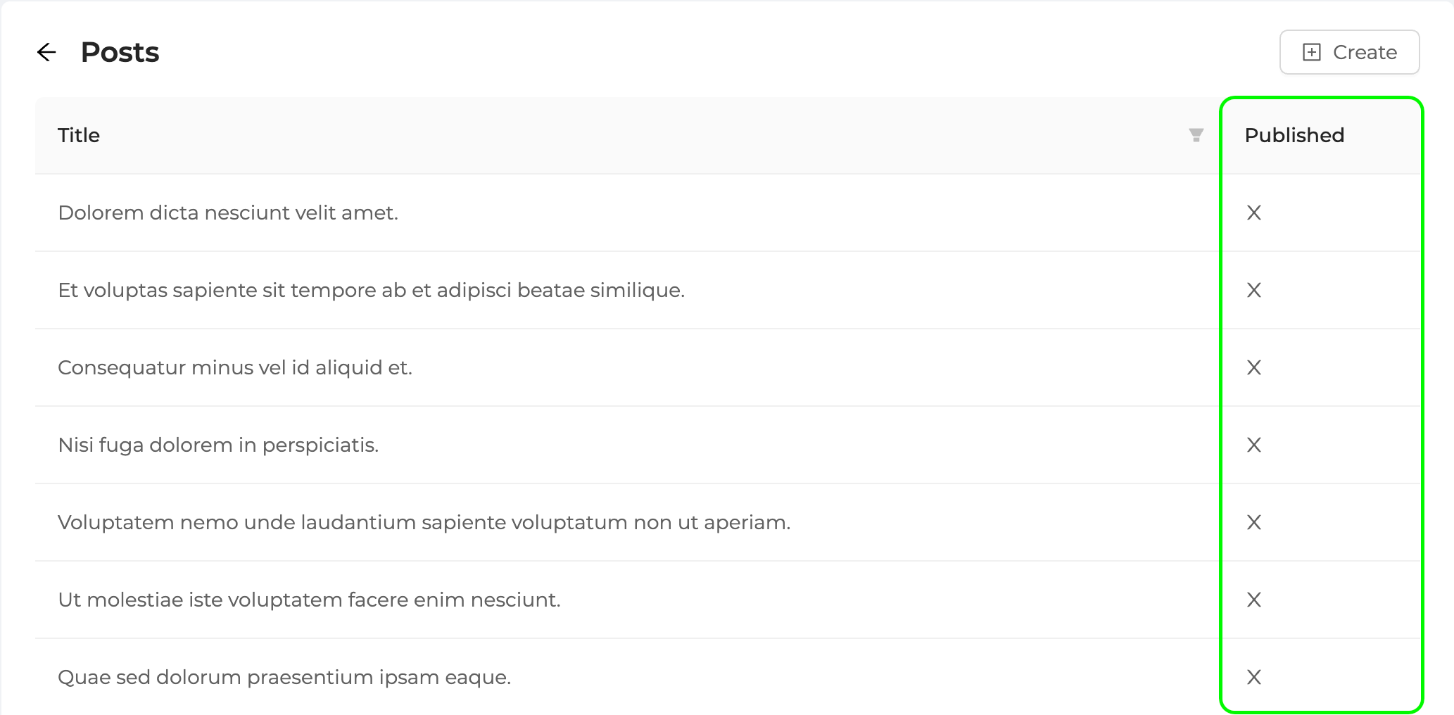
Let's see how we can use <BooleanField> with the example in the post list.
import {
    List,
    Table,
    BooleanField,
    Icons
} from "@pankod/refine";

export const PostList: React.FC = () => {
    const { CloseCircleOutlined, CheckCircleOutlined } = Icons;

    return (
        <List>
            <Table rowKey="id">
                ...
                <Table.Column
                    dataIndex="status"
                    title="Published"
                    render={(value) => (
                        <BooleanField
                            value={value === "published"}
                            trueIcon={<CheckCircleOutlined />}
                            falseIcon={<CloseCircleOutlined />}
                            valueLabelTrue="published"
                            valueLabelFalse="unpublished"
                        />
                    )}
                />
            </Table>
        </List>
    );
};
API Reference
Properties
| Property | Description | Type | Default |
|---|---|---|---|
| value | Field value | unknown | |
| valueLabelTrue | If there is a value, this is the text to use | string | "true" |
| valueLabelFalse | If there no value, this is the text to use | string | "false" |
| trueIcon | If there is a value, this is the icon to use | React.FC | object | <CheckOutlined /> |
| falseIcon | If there no value, this is the icon to use. | React.FC | object | <CloseOutlined /> |
| AbstractTooltipProps | Ant Design Tooltip properties | AbstractTooltipProps |