useEditableTable
useEditeableTable allows you to implement edit feature on the table with ease, on top of all the features that useTable provides.
useEditableTable return properties that can be used on Ant Desing's <Table> and <Form> components.
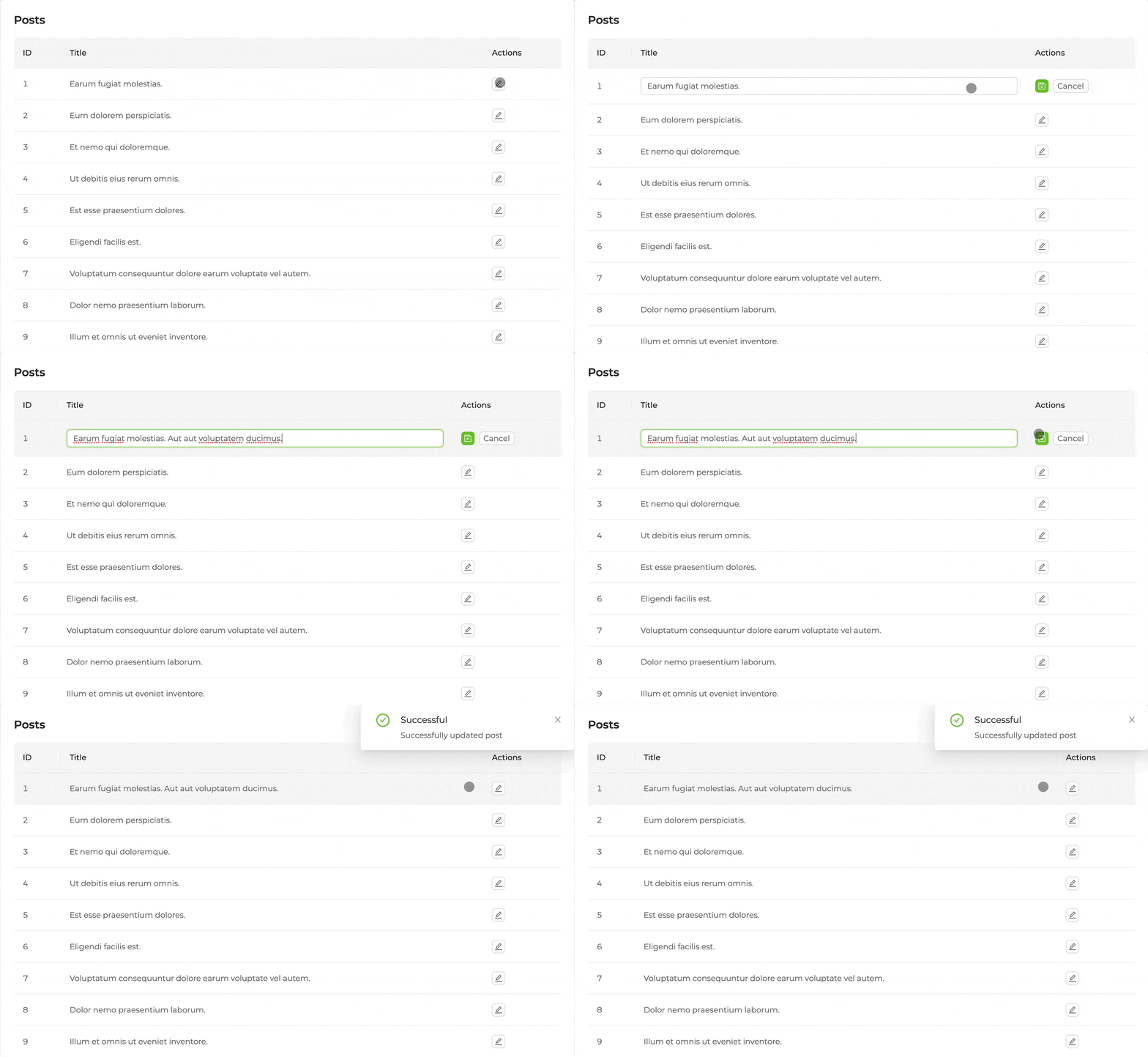
Editing with buttons
Let's say that we want to make the Post data where we show the id and title values a listing page:
This time, to add the edit feature, we have to cover the <Table> component with a <Form>component and pass the properties coming from useEditableTable to the corresponding components:
import { List, Table, useEditableTable, Form, TextField } from "@pankod/refine";

export const PostList: React.FC = () => {
    const { tableProps, formProps } = useEditableTable<IPost>();

    return (
        <List>
            <Form {...formProps}>
                <Table {...tableProps} rowKey="id">
                    <Table.Column dataIndex="id" title="ID" />
                    <Table.Column dataIndex="title" title="Title" />
                </Table>
            </Form>
        </List>
    );
};

interface IPost {
    id: string;
    title: string;
}
Now lets add a column for edit buttons:
import {
    List,
    Table,
    Form,
    Space,
    Button,
    SaveButton,
    EditButton,
    useEditableTable,
} from "@pankod/refine";

export const PostList: React.FC = () => {
    const {
        tableProps,
        formProps,
        isEditing,
        saveButtonProps,
        cancelButtonProps,
        editButtonProps,
    } = useEditableTable<IPost>();

    return (
        <List>
            <Form {...formProps}>
                <Table {...tableProps} rowKey="id">
                    <Table.Column key="id" dataIndex="id" title="ID" />
                    <Table.Column key="title" dataIndex="title" title="Title" />
                    <Table.Column<IPost>
                        title="Actions"
                        dataIndex="actions"
                        key="actions"
                        render={(_text, record) => {
                            if (isEditing(record.id)) {
                                return (
                                    <Space>
                                        <SaveButton
                                            {...saveButtonProps}
                                            size="small"
                                        />
                                        <Button
                                            {...cancelButtonProps}
                                            size="small"
                                        >
                                            Cancel
                                        </Button>
                                    </Space>
                                );
                            }
                            return (
                                <Space>
                                    <EditButton
                                        {...editButtonProps(record.id)}
                                        size="small"
                                    />
                                </Space>
                            );
                        }}
                    />
                </Table>
            </Form>
        </List>
    );
};
isEditing function that returns from useEditableTable lets us check whether a line is currently in edit mode or not.
For now, our post is not editable yet. If a post is being edited, we must show editable columns inside a <Form.Item> using conditional rendering:
import {
    List,
    Table,
    Form,
    Space,
    Button,
    SaveButton,
    EditButton,
    Input,
    TextField,
    useEditableTable,
} from "@pankod/refine";

export const PostList: React.FC = () => {
    const {
        tableProps,
        formProps,
        isEditing,
        saveButtonProps,
        cancelButtonProps,
        editButtonProps,
    } = useEditableTable<IPost>();

    return (
        <List>
            <Form {...formProps}>
                <Table {...tableProps} rowKey="id">
                    <Table.Column key="id" dataIndex="id" title="ID" />
                    <Table.Column<IPost>
                        key="title"
                        dataIndex="title"
                        title="Title"
                        render={(value, record) => {
                            if (isEditing(record.id)) {
                                return (
                                    <Form.Item
                                        name="title"
                                        style={{ margin: 0 }}
                                    >
                                        <Input />
                                    </Form.Item>
                                );
                            }
                            return <TextField value={value} />;
                        }}
                    />
                    <Table.Column<IPost>
                        title="Actions"
                        dataIndex="actions"
                        key="actions"
                        render={(_text, record) => {
                            if (isEditing(record.id)) {
                                return (
                                    <Space>
                                        <SaveButton
                                            {...saveButtonProps}
                                            size="small"
                                        />
                                        <Button
                                            {...cancelButtonProps}
                                            size="small"
                                        >
                                            Cancel
                                        </Button>
                                    </Space>
                                );
                            }
                            return (
                                <Space>
                                    <EditButton
                                        {...editButtonProps(record.id)}
                                        size="small"
                                    />
                                </Space>
                            );
                        }}
                    />
                </Table>
            </Form>
        </List>
    );
};
With this, when a user clicks on the edit button, isEditing(lineId) will turn true for the relevant line. This will also cause <TextInput> to show up on the line thats being edited. When the editing is finished, new value can be saved by clicking <SaveButton>.
By giving the <Table.Column> component a unique render property, you can render the value in that column however you want.
Refer to <Table.Column> documentation for more information.

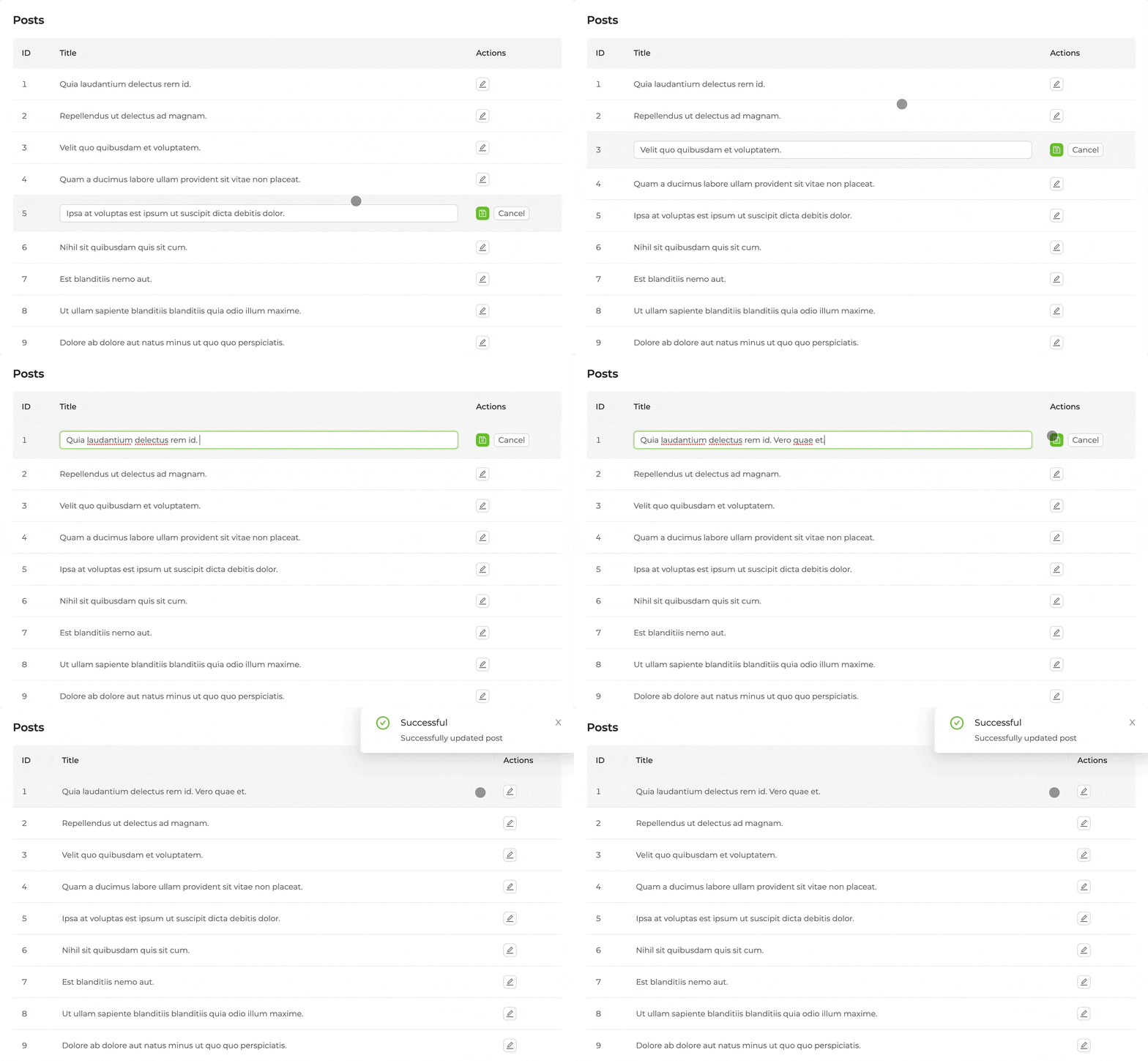
Editing by clicking to row
A line with the id value can be put to edit mode programatically by using the setEditId function that returns from useEditableTable.
The onRow property of the <Table> component can be used to put a line to editing mode when its clicked on. Function given to the onRow property is called everytime one of these lines are clicked on, with the information of which line was clicked on.
We can use setEditId to put a line to edit mode whenever its clicked on.
import {
    List,
    Table,
    Form,
    Input,
    TextField,
    useEditableTable,
} from "@pankod/refine";

export const PostList: React.FC = () => {
    const { tableProps, formProps, isEditing, setEditId } =
        useEditableTable<IPost>();

    return (
        <List>
            <Form {...formProps}>
                <Table
                    {...tableProps}
                    key="id"
                    onRow={(record) => ({
                        onClick: (event: any) => {
                            if (event.target.nodeName === "TD") {
                                setEditId && setEditId(record.id);
                            }
                        },
                    })}
                >
                    <Table.Column key="id" dataIndex="id" title="ID" />
                    <Table.Column<IPost>
                        key="title"
                        dataIndex="title"
                        title="Title"
                        render={(value, data: any) => {
                            if (isEditing(data.id)) {
                                return (
                                    <Form.Item
                                        name="title"
                                        style={{ margin: 0 }}
                                    >
                                        <Input />
                                    </Form.Item>
                                );
                            }
                            return <TextField value={value} />;
                        }}
                    />
                </Table>
            </Form>
        </List>
    );
};

API
Properties
| Key | Description | Type |
|---|---|---|
| permanentFilter | Default and unchangeable filter. | CrudFilters |
| initialCurrent | Initial page index. | number |
| initialPageSize | Number of records shown per initial number of pages. | number |
| initialSorter | Initial sorting. | CrudSorting |
| initialFilter | Initial filtering. | CrudFilters |
| syncWithLocation | Sortings, filters, page index and records shown per page are tracked by browser history. | boolean |
| onSearch | When the search form is submitted, it creates the 'CrudFilters' object. Refer to search form to learn how to create a search form. | Function |
| queryOptions | react-query's useQuery options | UseQueryOptions<{ data: TData[]; },TError> |
| metaData | Metadata query for dataProvider | MetaDataQuery |
| liveMode | Whether to update data automatically ("auto") or not ("manual") if a related live event is received. The "off" value is used to avoid creating a subscription. | "auto" | "manual" | "off" |
| liveParams | Params to pass to liveProvider's subscribe method if liveMode is enabled. | { ids?: string[]; [key: string]: any; } |
| onLiveEvent | Callback to handle all related live events of this hook. | (event: LiveEvent) => void |
Type Parameters
| Property | Desription | Type | Default |
|---|---|---|---|
| TData | Result data of the query. Extends BaseRecord | BaseRecord | BaseRecord |
| TError | Custom error object that extends HttpError | HttpError | HttpError |
| TVariables | Values for params | {} | |
| TSearchVariables | Values for search params | {} |
Return values
| Property | Description | Type |
|---|---|---|
| searchFormProps | Ant Design <Form> props | FormProps<TSearchVariables> |
| tableProps | Ant Design <Table> props | TableProps<TData> |
| tableQueryResult | Result of the react-query's useQuery | QueryObserverResult<{ data: TData[]; total: number; }, TError> |
| sorter | Current sorting state | CrudSorting |
| filters | Current filters state | CrudFilters |
| form | Ant Design <Form> instance | FormInstance |
| formProps | Ant Design <Form> props | FormProps |
| saveButtonProps | Props for a submit button | { disabled: boolean; onClick: () => void; } |
| cancelButtonProps | Props for a cancel button | { onClick: () => void; } |
| editButtonProps | Props for an edit button | { onClick: () => void; } |
| queryResult | Result of the query of a record | QueryObserverResult<T> |
| mutationResult | Result of the mutation triggered by submitting the form | UseMutationResult<T> |
| formLoading | Loading state of form request | boolean |
| cloneId | Record id for clone action | "string" | "number" |
| setCloneId | cloneId setter | Dispatch<SetStateAction< string | number | undefined>> |
| editId | Record id for edit action | "string" | "number" |
| setEditId | editId setter | Dispatch<SetStateAction< string | number | undefined>> |
| isEditing | Check if is editing | (id: string) => boolean |