useModal
useModal hook allows you to manage a modal. It returns the props to manage Ant Design's Modal components.
const { modalProps, show, close } = useModal();
You can pass the returned modalProps as props to Modal component and use show and close methods to hide and show it. It does not provide any functionality besides this. You can use this hook anywhere.
Usage
Let's see an example:
import {
    List,
    Table,
    useTable,
    useModal,
    Modal,
    Button,
} from "@pankod/refine";

export const PostList: React.FC = () => {
    const { tableProps } = useTable<IPost>();

    const { modalProps, show, close } = useModal();

    return (
        <>
            <List
                pageHeaderProps={{
                    extra: <Button onClick={show}>Show Dummy Modal</Button>,
                }}
            >
                <Table {...tableProps} rowKey="id">
                    <Table.Column dataIndex="id" title="ID" />
                    <Table.Column dataIndex="title" title="Title" />
                    <Table.Column dataIndex="content" title="Content" />
                </Table>
            </List>
            <Modal onOk={close} {...modalProps}>
                Dummy Modal Content
            </Modal>
        </>
    );
};

interface IPost {
    id: string;
    title: string;
    content: string;
}
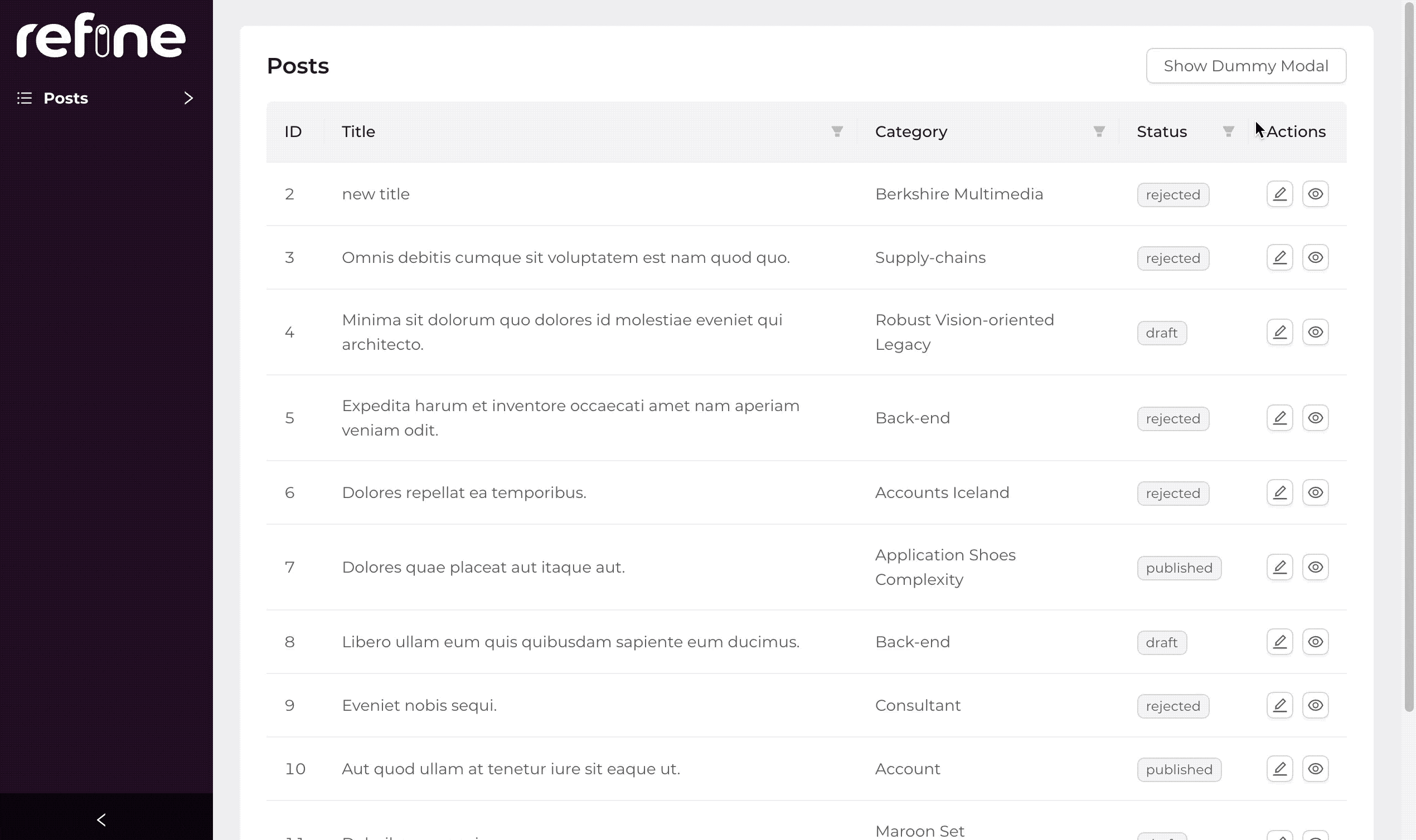
Here, we show a button somewhere on the page and use show on it's onClick callback to trigger opening of the modal below the <List> component. When the user clicks on the button, the modal appears.
We also used onOk callback from Ant Design Modal to add close as a callback on it's button. When the user clicks on this button, thus triggering close function, the modal dialog will be closed. We do this to demonstrate close function.
API Reference
Return Value
| Key | Description | Type |
|---|---|---|
| modalProps | Props for managed modal | ModalProps |
| show | A function that can open the modal | () => void |
| close | Specify a function that can close the modal | () => void |