Export
<ExportButton> is an Ant Design <Button> with a default export icon and a default text with "Export". It only has presentational value.
Refer to the for more detailed information about useExport. →
Usage
Use it like any other Ant Design <Button>. You can use it with useExport:
/src/pages/posts/list.tsx
import { useExport } from "@pankod/refine-core";
import {
    List,
    Table,
    useTable,
    ExportButton,
} from "@pankod/refine-antd";

export const PostList: React.FC = () => {
    const { tableProps } = useTable<IPost>();

    const { triggerExport, isLoading: exportLoading } = useExport<IPost>();

    return (
        <List
            pageHeaderProps={{
                extra: (
                    <ExportButton
                        onClick={triggerExport}
                        loading={exportLoading}
                    />
                ),
            }}
        >
            <Table {...tableProps} rowKey="id">
                <Table.Column dataIndex="id" title="ID" />
                <Table.Column dataIndex="title" title="Title" />
            </Table>
        </List>
    );
};

interface IPost {
    id: number;
    title: string;
}
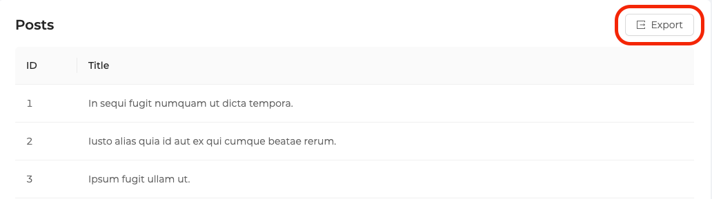
It looks like this:
Properties
hideText
It is used to show and not show the text of the button. When true, only the button icon is visible.
import { ExportButton } from "@pankod/refine-antd";

export const MyExportComponent = () => {
    return <ExportButton hideText />;
};
API Reference
Properties
External Props
It also accepts all props of Ant Design Button.